
Học cách tạo và lưu nhiều loại báo cáo Power BI.
Tạo báo cáo
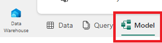
1. Chọn chế độ xem Model từ các tùy chọn ở góc dưới bên trái, ngay ngoài bảng vẽ.
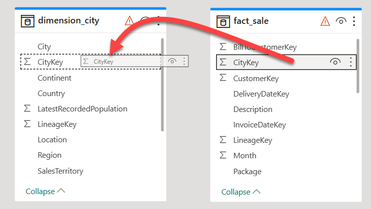
2. Từ bảng fact_sale, kéo trường CityKey và thả nó vào trường CityKey trong bảng dimension_city để tạo một mối quan hệ.
3. Trên cài đặt Create Relationship:
- Bảng 1 được điền thông tin từ fact_sale và cột CityKey.
- Bảng 2 được điền thông tin từ dimension_city và cột CityKey.
- Cardinality: chọn Many to one (*:1).
- Cross filter direction: chọn Single.
- Để ô bên cạnh Make this relationship active được chọn.
- Đánh dấu ô bên cạnh Assume referential integrity.
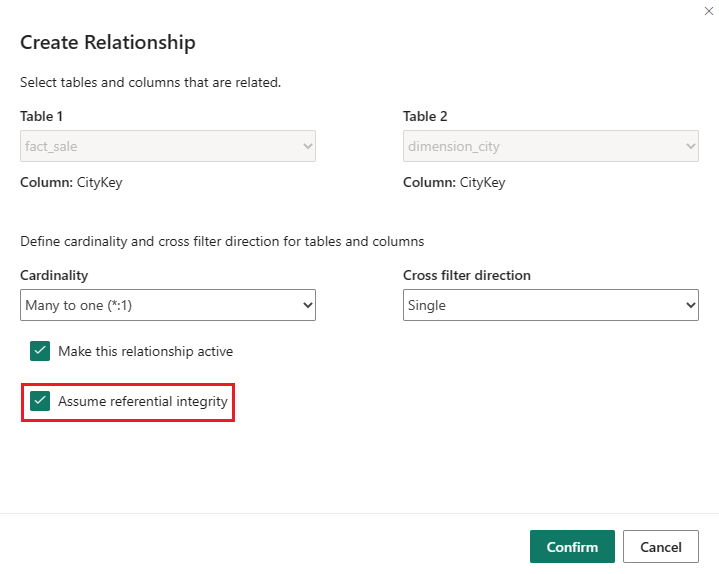
4. Chọn Confirm.
5. Từ tab Home của ribbon, chọn New report.
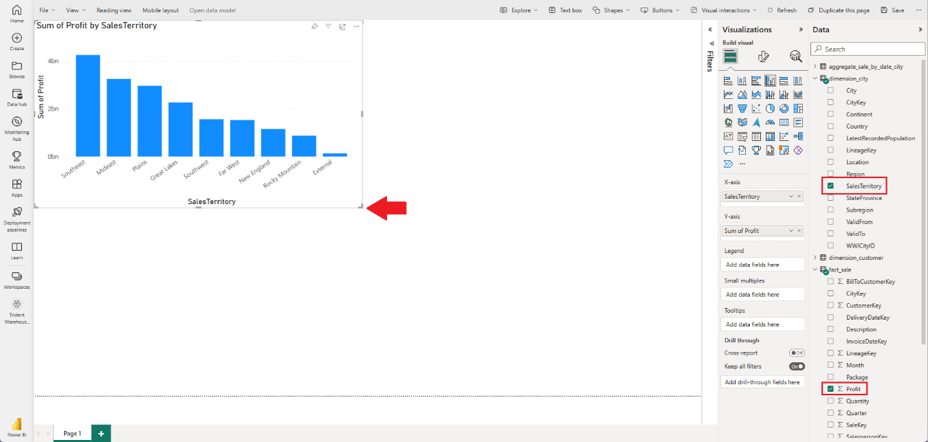
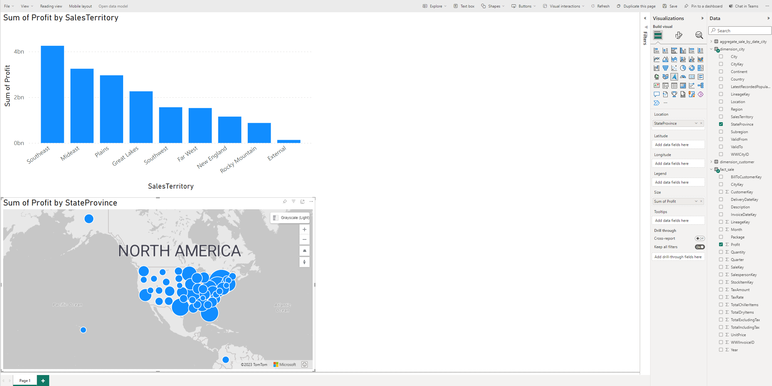
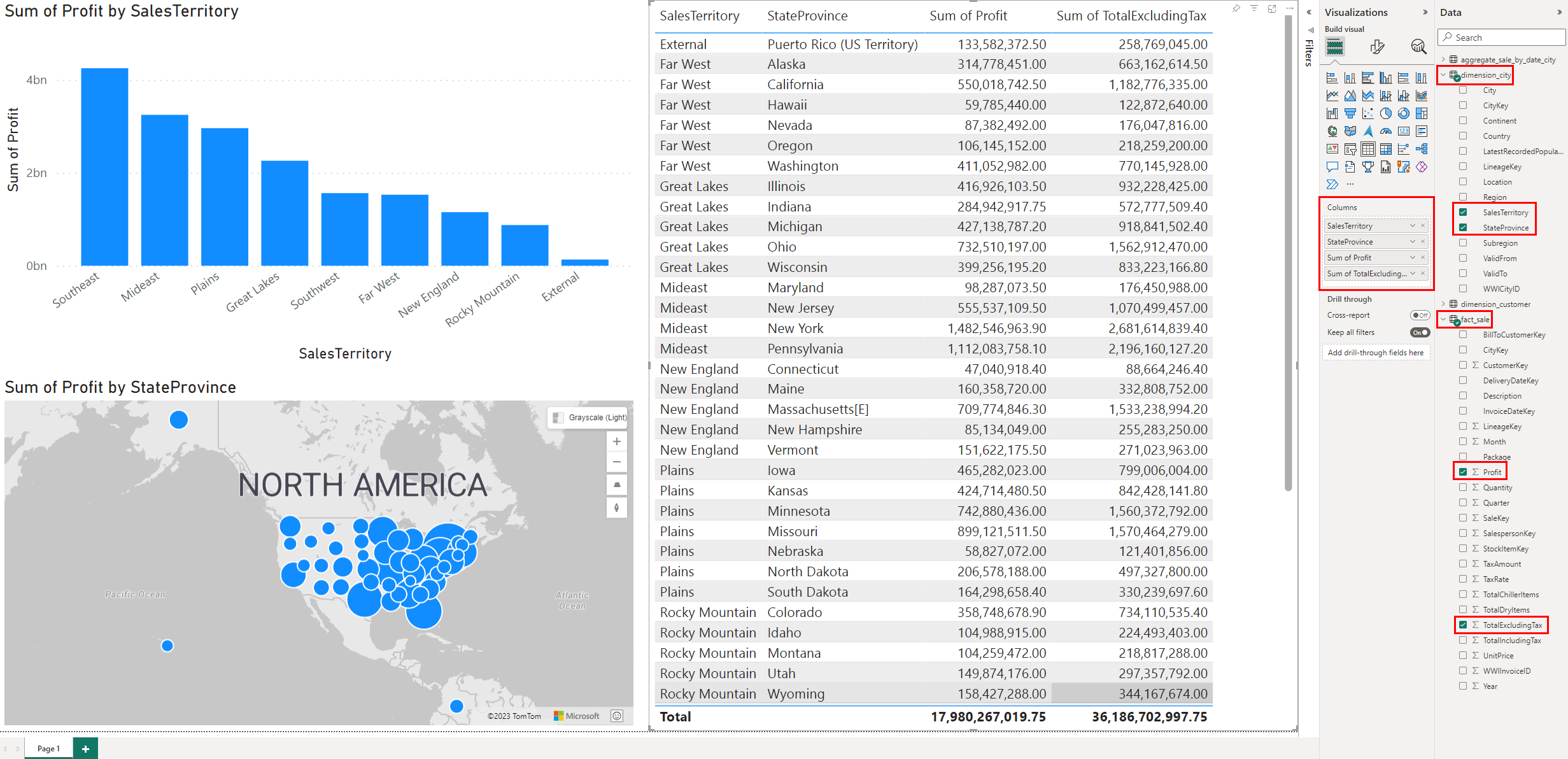
6. Xây dựng một Column chart:
- Trên bảng Data, mở rộng fact_sales và đánh dấu ô bên cạnh Profit. Điều này tạo một biểu đồ cột và thêm trường vào trục Y.
- Trên bảng Data, mở rộng dimension_city và đánh dấu ô bên cạnh SalesTerritory. Điều này thêm trường vào trục X.
- Di chuyển và điều chỉnh kích thước biểu đồ cột để chiếm góc trái trên của bảng vẽ bằng cách kéo các điểm neo ở các góc của hình ảnh.
7. Chọn bất kỳ nơi nào trên bảng vẽ trống (hoặc nhấn phím Esc) để biểu đồ cột không còn được chọn.
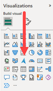
8. Xây dựng một biểu đồ Maps:
- Trên bảng Visualizations, chọn biểu đồ ArcGIS Maps for Power BI.
- Từ bảng Data, kéo StateProvince từ bảng dimension_city vào hộp Vị trí trên bảng Visualizations.
- Từ bảng Data, kéo Profit từ bảng fact_sale vào hộp Kích thước trên bảng Visualizations.
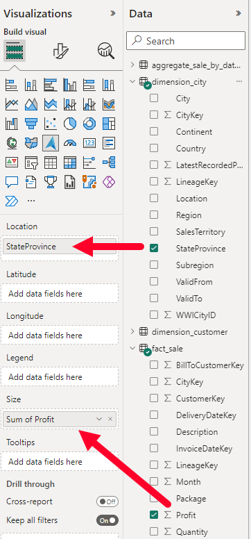
- Nếu cần thiết, di chuyển và điều chỉnh kích thước bản đồ để chiếm góc trái dưới của bảng vẽ bằng cách kéo các điểm neo ở các góc của hình ảnh.
9. Chọn bất kỳ nơi nào trên bảng vẽ trống (hoặc nhấn phím Esc) để biểu đồ bản đồ không còn được chọn.
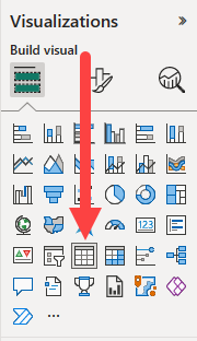
10. Xây dựng một biểu đồ Table:
- Trên bảng Visualizations, chọn biểu đồ Table.
- Từ bảng Data, đánh dấu ô bên cạnh SalesTerritory trên bảng
dimension_city. - Từ bảng Data, đánh dấu ô bên cạnh StateProvince trên bảng
dimension_city. - Từ bảng Data, đánh dấu ô bên cạnh Profit trên bảng
fact_sale. - Từ bảng Data, đánh dấu ô bên cạnh TotalExcludingTax trên bảng
fact_sale. - Di chuyển và điều chỉnh kích thước biểu đồ cột để chiếm nửa phải của bảng vẽ bằng cách kéo các điểm neo ở các góc của hình ảnh.
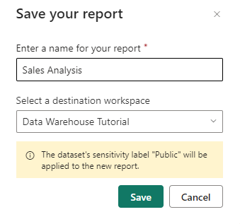
11. Từ thanh ribbon, chọn File > Save.
12. Nhập Sales Analysis là tên của báo cáo của bạn.
13. Chọn Save.
Nguồn: https://learn.microsoft.com/en-us/fabric/data-warehouse/tutorial-power-bi-report
